
Tuesday, 29 December 2015
Friday, 18 December 2015
Final Video
This is the final version of my music video. Due to the spec of the machine I produced the video on I wasn't able to render and export the video at the highest quality. However due to the fact that the quality is also dependant on the screen and internet connection that the audience use to view the video on this isn't an issue.
I also uploaded the video to Vimeo however because I am not a paying member the maximum quality is 720p. However I have still attached it bellow:
Ayla - Afterglow from Benedict Moore on Vimeo.

Monday, 14 December 2015
Second Cut
After receiving feedback on my rough cut I produced a second cut. Due to my Macbook Pro's specification exporting takes a large amount of time, therefore I haven't uploaded the rough cut.
Thursday, 10 December 2015
Digipak: Production

Monday, 30 November 2015
Digital Storyboard
Below is my digital storyboard detailing the shots, when they occurred and the meaning/purpose of each.


Saturday, 28 November 2015
Editing: Change Of Approach
Obviously a huge amount of producing any product is about learning and evolving. This is the first time that I have worked by myself and had the freedom to really understand and develop the skills to produce a piece of work that is of the highest quality. At first this manifested itself in me upgrading from Final Cut to Adobe Premier. The thought behind this was that using more professional editing software would allow me to create a more professional video. I immediately noticed a difference in the way that the footage could be edited in comparison to Final Cut. However recently I have found out about the Adobe colour correction software called Speedgrade. At first my initial thought is that this project didn't justify me learning yet another piece of high end software however I want this piece to really reflect my want to produce the best piece of work that I can. And therefore to not bother learning the software and at least trying to use it would cause me a huge sense of regret. Therefore at this point in time I am investigating whether I would be able to use Adobe Speedgrade to do the colour correction for my video thus improving the look that I am able to achieve. Whilst producing this video, and work outside of my course, I try to not compare myself with the people around me but instead the people that I want to be around. Therefore it is key for me to understand the way the professionals that I admire work and adopt that approach.
Thursday, 19 November 2015
Editing: Keyframing
Editing: Titles
Credit:
Planning:
For the titles in my video I produced a post researching examples of effective titles that I want to draw influence from. The approach I am planning to take is a minimal approach. Apart from anything the crew consists of one member therefore it would be unnecessary to list me as the producer, director, camera man etc. Therefore instead I am simply going to put a "Directed by" title. My first thought is to use the simple spaced out chords at the beginning to set the titles too. Obviously I have already used them to set key footage too therefore I don't want to distract from this. As a result I am planning on having the text featured with an opaque background. For the bands name I wont decide how to present that until I can view the finished product and then I will make an appropriate decision. At the moment I am thinking it may follow the lines of being painted and then filling the majority of the screen.For the directed by title I want to emulate the look of the title on the Kurt Vile video Pretty Pimpin.

The title has a very clean, strong and graphic look. I also like the way that Henry has chosen to separate the presentational style of his name and the title. Although they have a continuous theme throughout both parts the title and the name are both different sizes with the name being bigger. The shot that the title has been overlaid is a scene setting shot showing the surrounding areas of the main building where the majority of the video is featured. I will also do the same to show the surrounding area.
Construction:
Because I wanted the band name to come before the credit I decided to position the credit over the third shot of the video. the shot that I used is of the Empire State Building, taken from the ground during the day. Obviously the Empire State Building has a very iconic look too it. To enhance this and draw connotations of the golden age of cinema I have decided to put the footage in black and white. Also added to that is that I am going with a off white grey colour for my text which would look good over the colour footage however it looks more harmonious overlaid onto a monochromatic piece of footage.


Here I have included screenshots of both the colour and black and white versions. Until the final stages of editing I will be able to change this and will make a final call then.
 The font I have chosen to use is called Myriad Pro. The reason I have gone for this is because of the strong clean look it has. Also because like the Daniel Henry credit I wanted to obtain that divided look by separating the title and the credit stylistically. Myriad Pro offers several customisation options which allowed me to stylise the two halves differently. The screenshot on the left clearly illustrates this. After trying out several variations I have settled on having the title larger than my credit. There are several reasons for this. Primarily the reason is because it could look pretentious to really emphasise ones own name on a piece of work of this nature. Obviously I am not a famous director and therefore people aren't going to be watching the video because I have directed it. Instead they will be watching it because they like the artist, and too those who are interested my name is semi subtly displayed.
For the credit section I have put the text in capitals. Then I applied a condensed bold style to the text to emphasise it. For the credit I typed my name out in all lower case and then used the small caps option to make it like a scaled down version of the text to the left of it. The font size I used on both pieces is 60pt. The default is 100pt, which is what I was going to go for. However because I would want my video to be displayed on large screens the name seemed too large. Instead dropping the size -40pts makes the text appear in proportion whilst also not completely dominating the frame. Although as stated I didn't want to dominate the frame with the credit I did want it to have a certain implied confidence by having it centered. By positioning my name centrally it tells the viewer that I am not shouting from the roof tops that I directed the piece but instead that I made it and I am pleased with it to the point that I can confidently put my stamp of approval on it.
 Title
Title
For the title I painted the bands name by hand using watercolour. Once the paint was dry I scanned the image in. In Photoshop I bumped up the contrast and removed the background. By upping the contrast it enabled me to more clearly define the background and therefore made it easier to remove. Once removed I applied a colour overlay the layer, then rasterised it and then sat it on a green background. Once imported into Adobe Premier I applied a green screen effect to the layer and removed the background thus giving the end result.
Editing: Rough Cut Feedback
After producing the rough cut of my video I wanted to receive feedback from a select group. The video I showed only included two sections of New York footage. At the start there were a few seconds and at 1:30 there were two shots. The main critique I wanted was on the performance shots as they are the spine of the video. The reason I chose a select group was because I wanted them to represent my target audience. Also the people that I chose were people who's own work I admired and therefore hopefully by them giving me feedback my work might then be of a similar standard. Therefore I selected a classmate, whose work is of an incredibly high standard, my teacher, who has a wealth of knowledge of film, the media technician, who also has a vast range of cinematography, and my dad, who I knew would provide very objective feedback. The feedback was as follows:

- Include a instrumental lead section on the track to further develop it and to add another focal point
- Add more shots of the performers
- Include a variety of angles
- Add some wider shots
Below is a screenshot of the email from my teacher including the feedback he provided after viewing the video:

Obviously there were some improvements suggested but for a first draft the video seems to be heading in the correct direction. I had also made some notes for improvement after producing the first draft and reviewing the performance footage. Below I have bullet pointed my initial ideas for improvement:
- Film over the shoulder shots between both guitarists - Looking over Shaun's shoulder at Youness and over Youness's shoulder looking at Shaun. For the shot over Shaun's shoulder I would have him fill the frame with his hair hanging down, then he would pull it back with his hand and turn his head to look at Youness. For the shot over Youness's shoulder he would be looking down at his guitar and then look up at Shaun, at that point Shaun would look across at him. These shots would show the interaction between the two guitarists. It would also show them as admiring each others playing thus elevating the track from an audience perspective as they would see the two players creating a sound that they appear to be pleased with. The shots of Shaun looking at Youness would be taken when Youness plays the lead part showing Shaun as being captivated by Youness's skill. The shots of Youness looking at Shaun would be when Shaun adds the accents to the track. This would show Youness, the main guitarist, admiring the finesse that Shaun was adding to the track.
- Film over the shoulder shots between the bass player and drummer - At a point where there will be a drum fill, yet to be added, I will film the bass player from a profile view and then looking over at the drummer. As he does there would be a focus pull to show the drummer playing the fill. This would add emphasis to the interaction but also it would showcase each musicians role.
- Film from the other side of the drummer - By filming from the hi-hat side of the drum kit I would be able to show more of the action, the snare drum, hi-hat and bass drum pedal moving. With the focus on the drummer it could also show the other musicians in the background out of focus. This shot would work as it would contextualist the whole scene as it would show another angle to the room allowing the viewers to piece together the scene.
- Film the shadows on the wall - Around the room there is very little plain wall, however to the side of the drum kit the wall is fairly plain. With the lights setup appropriately I would be able to film the drummers shadows as he plays. Obviously the drums is a fairly physical instrument so the shadows would reflect that and add to the energy. I would probably film him as he plays the sixteenth note section towards the end as that is one of the more engaging sections from an audience perspective.
- Film a shot of the drummer and guitarists back through the window - Film through the window to get a wider perspective of the performance which would otherwise be impossible to achieve due to the restrictions of the room.
- Film guitar lead part - Film some more stable shots of the guitar lead section with the guitarist doing more movement and the camera less. With the rest of the work it is the other way round and due to the energy and impact of a lead part it makes sense that the guitarist would have added energy and motion to his presence.
- Film Shaun lifting his hair back - Shaun has long hair which links with the conventions discussed in my star image post. Therefore by silhouetting him against a light and filming him lifting it back it adds the iconography that the piece needs to elevate the status of the performers.
- Film drums through the front - Film from in between the rack tom, snare and hi-hat with a low angle looking up and capturing the light on the tom.
- Film a tracking shot around the hi-hat at the end - When the sixteenth note section comes in film a tracking shot moving from left to right from the front of the hi hat to be cut in with the other two to make it a three shot section adding depth and a range of perspectives of the action.
- Film side shots of the guitarists performing - Similar to these shots: https://youtu.be/bqPXSqbKR1U?t=2m38s
- Film the guitarists near a window - I would film the two guitarists and the bass player and choose the most appropriate one later on. If I could get them performing near the window without eclipsing it I would potentially be able to mask the window and add in footage of New York at night.
The final shot that I would add would be a test to produce however it could show off artistic flare and also join the footage of New York with the footage of the performance. Although it may not make the final cut I thought it might just resolve the piece. There are several issues that I will have to solve and resolve if it is to work. For example I am not sure if I have perfectly steady footage of New York at night. Also any footage taken from the top of the Rockefeller Center might look a little unbelievable as obviously that is so high up and therefore may not look like the view from a rehearsal studio.
Editing: Secondary Colour Grading
After balancing out the brightness & contrast and completing the primary colour correction on the clips the next step is a apply a colour grade to the footage. By definition colour grading is the process of tastefully applying a colouration to the footage to evoke a particular mood or aesthetic. In this case I have started by analysing the colouration on footage from some of my favourite films so that I can see how I need to alter my footage to get a similar effect. The first film I have analysed is Nightcrawler. From a cinematography perspective this film is stunning. However for this I am just going to be drawing influence from how the footage has been coloured. The frame that I have chosen to analyse is one where the main lighting source matches that of mine in my performance footage.


 Obviously this shot is very dark with the main source of light being an orange street light. This is not too dissimilar to the lighting of my performance footage therefore shouldn't be too hard to match. After importing this into Adobe Premier I used the built in reference monitor to examine the colours of the clip. To load the reference monitor I had to go into Window>Reference Monitor. The first step is to examine the YC Waveforms. Put simply the YC Waveforms option displays the luminance of the shot. This means it shows the dynamic range of lighting in the shot. Along the information along the x axis is directly related to where the light is in the frame. For example there is a spike in the right half of the graph. That relates to the fact that that is where the streetlight is. The rest is fairly compressed with a very low level of light throughout. This isn't too dissimilar to my footage which is also very selectively lit. The graph on my footage looks fairly similar. The dynamic range isn't too extreme apart from a couple of spikes, much like the above frame from Nightcrawler. One of the slight differences is that under close examination the footage from Nightcrawler sits between 0.32-0.4, whereas my footage is slightly darker sitting at 0.3-0.38.
 The next step in matching the two pieces is getting the colour right. To do this I have used the Vectorscope. A Vectorscope is a form of oscilloscope used in audio and video production. In this case it is used to examine where the colour of the footage sits on a colour wheel. It is often used to analyse where the colour and saturation of footage sits in relation to broadcast limits. I will be using it in that regard however for me the main focus is to use it to match the colour of my footage too Nightcrawler. In the screenshot to the right the Vectorscope has been used to analyse the frame from Nightcrawler. The green patch on the Vectorscope represents the colour in the clip. The graph itself mirrors the colour wheel shown above. Therefore the green patch sitting on the eleven o'clock line means that the main colour of the clip is between green and red. At the bottom the green follows the skin tone line however it tails off at the top towards the yellow/green portion of the colour wheel. After I loaded up the Vectorscope on my footage it displayed a pattern not to far off the one in the above screenshot. Where Nightcrawler pretty much follows the skin tone line and tails off at the top mine curves out towards the red side slightly and then curves towards the line at the top.
Wednesday, 18 November 2015
Editing: Vignette Techniques
Some of the footage used in my video appeared too confusing/distracting when viewed in sequence. This was often for a number of reasons but predominantly it was because the framing may have included too much surrounding scenery or the background was really busy. By creating a vignette I could effectively darken areas of distraction and focus the viewers attention on the center point.
 This effect was used on the credit shot as the text was centered and around the main subject of the shot, the Empire State Building, there was a moderate amount of foliage that was slightly distracting. The opacity of the vignette is very low so it is almost undetectable. Some may regard this as unimportant if it has been done to such a minimal level however it does benefit the shot as the attention is more focused on the information in the center of the frame rather than the scene around it.
 This effect was used on the credit shot as the text was centered and around the main subject of the shot, the Empire State Building, there was a moderate amount of foliage that was slightly distracting. The opacity of the vignette is very low so it is almost undetectable. Some may regard this as unimportant if it has been done to such a minimal level however it does benefit the shot as the attention is more focused on the information in the center of the frame rather than the scene around it.
Editing: Primary Colour Correction
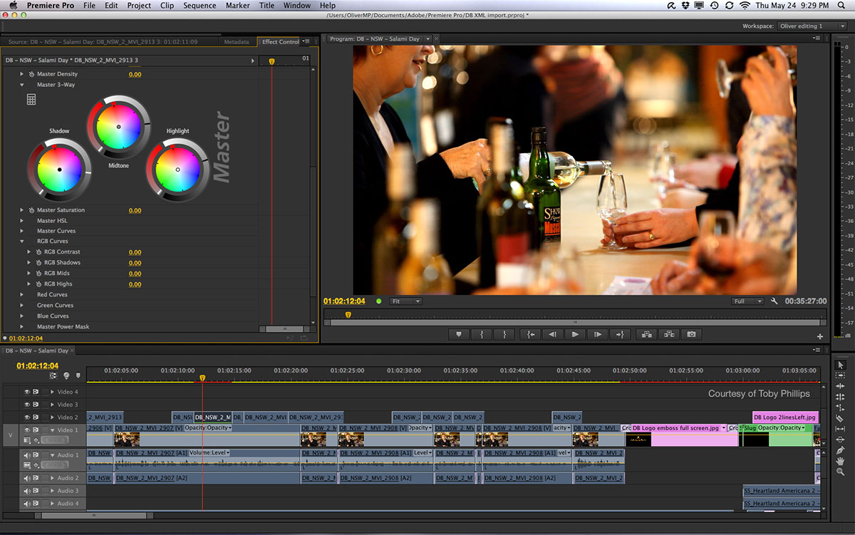
 After balancing out the Brightness & Contrast of my sequence I have gone on to try and tastefully correct the colouration. Although the terms colour correction and colour grading are often used in an interchangeable way they technically stand for different definitions. For my production chrominance and luminance. Colour grading refers to altering the colour of the video in a way that enhances the overall presentation of the product. Any process referred to as colour correction is a primary process of balancing out the colouration and any colour casting that may have occurred. After controlling the brightness and contrast, as shown in the top screenshot I then started to use the fast colour corrector to perform the primary colour correction. Within the fast colour corrector there is an option displayed between, the output and layout sections, called split view. By using this option I am able to split the preview window in two either vertically or horizontally. On one half the raw (uncorrected footage) is shown and on the other side the corrected footage is shown. In this screenshot, below, I have included the preview window which shows the colour correction. In this screenshot I had enabled a horizontal split view, meaning the top half is colour corrected and the bottom not. Although it is barely visible on the right half of the frame there is a split.
the
Monday, 16 November 2015
Editing: Brightness + Contrast
 After putting the first batch of performance shots in sequence and making the first cuts I noticed that the footage looked far too dark and the contrast was way too high. The problem with this, aside from the fact that it looked undesirable is that due to the contrast a large amount of the detail was lost in the blacks. My natural instinct was to go into Video Effects and use the Brightness & Contrast tool, as shown on the right, to adjust the respective values to balance my footage out. At first I made an adjustment of -4.0 on the brightness and -16.0 on the contrast. I then saved this as a preset. This meant that I could drag that modified Brightness & Contrast adjustment to each of the performance clips. Because the lighting remained the same whilst I filmed the performance clips with minor refinement the same values of brightness and contrast would work to achieve the same effect on each clip.
 However after doing some research I found out that the Brightness & Contrast tool is fairly outdated as it isn't the most effective tool for adjusting the brightness and contrast. After watching a YouTube tutorial, by Creative COW, explaining the finer qualities of adjusting brightness and contrast in Adobe Premier I have decided to use the Fast Colour Corrector tool to adjust the blacks, whites and the gamma of each clip to neutralise it and retain the detail at both ends of the spectrum. The next two screenshots are taken from the video. They demonstrate the difference between using the Fast Colour Corrector and the Brightness & Contrast tools. On the top the Brightness & Contrast tool has been used. As the first screenshot shows the brightness slider has been used to increase the brightness. This has reduced the quality of the clip by lessening the range. What were the blacks in the shot are now the mid-tones.
 On the bottom screenshot the Fast Colour Corrector tool has been used and has yielded different results. Instead this time the blacks have been adjusted however unlike the top of the two screenshots the range is still maintained. This is visible by the way that the white tones are still distinguishable and are still white unlike the top one where the blacks have been crushed. On both of the screenshots the reference monitor is clearly visible. On the top the range has obviously been reduced however on the bottom the range remains unaffected however the blacks have changed.
Editing: Sequence
The first step of the editing process was for me to import the files from the performance shoot and to start aligning them with the music. After looking through at the footage in finder I realised that for each performer I had one or two good takes. Therefore I would create a main channel for each instrument that then subsequent layers could be stacked upon. For each instrument, with the exception of guitar, I labeled them A1. For example with the drums they were called Drum A1. With the guitar because I had two actors the primary (main) actor was assigned the label of A whereas the secondary actor was given the B label. When creating the video track I would also create a matching audio layer that I would import the clip audio into. I would then click the drop down menu at the header of each layer to further examine the waveforms of the audio. I would then examine the waveforms belonging to the clip audio and the track that the video is for. Once I matched them I would then mute the clip audio and move onto the next layer. For example for drums I ended up having three layers labeled A1, A2 and A3 respectively. The main continuos footage was placed on the A1 layer. When I reviewed the footage and found specific shots that I wanted in other pieces of footage I would import them into the A2 and A3 layers. For each instrument I would use the built in colour labels to identify the groups that the footage belongs too. By doing that it made it easier for me to identify what the content of each clip was without having to look at. For example the drums are all coloured in "Mango". This means that when I'm zoomed in and I see a clip of that colour I know what it is content wise.

Sunday, 15 November 2015
Saturday, 14 November 2015
Shots for Improvements
Below is a list of ideas that could benefit the overall look and feel of my piece:
Over the shoulder showing the interaction between the members
behind the drum kit
Through the window looking at the drummers back
Shots from the side of a guitarist :https://youtu.be/bqPXSqbKR1U?t=2m38s
Guitar lead part
Shots between drums looking up at the drummer
shots from in between rack tom snare and hi hat looking up
guitarist plugging in
Shot of someone walking in
Shot of shaun with hair over his face silhouetted infront of a light
Workflow
Because I am working by myself for the research, planning, production and editing of my video I wanted to figure out a professional work flow that I could adhere to. By doing this it would allow me to work in stages instead of working in the incorrect order and having to unpick work. For example during the production of my AS media piece I was eager to start working on the colour grading therefore I did that before the first sequence was in place. I then realised that the grading I had applied was not appropriate when viewed alongside the other shots and I then had to remove hours of work. That is why I have adapted a production workflow found on Wikipedia for the production of my own music video.


- At the first stage of this list I imported the footage off my SD cards into folders labeled correctly.
- The second stage was to go through the folders of footage and use the tag tool to tag specific shots that I definitely wanted to make the video.
- The third stage is still in progress and is currently adhering to this list. After producing the initial assembly I have gone on to produce the rough cut.
- Once the final cut of the video is produced, including New York footage and new performance shots I will be ready to move onto colour correction.
- At that point once the video is finalised, because I am also playing on the track, I will send a copy to Youness, who is responsible for producing the track. He will then tweak the parts and we will record the live instruments. After this he will spend time mixing and EQ'ing the track.
Shoot Two Evaluation
After shooting footage on location in New York I have gone onto film my performance shots with the band. The experience I had of working by myself and having to setup, direct, operate the cameras and keep the actors happy was new to me but a great experience. One of the main lessons that I learn't was that despite all of the planning there are aspects that I had to be willing to adapt and change on set. In this regard I had to learn to think fast and be resourceful. The first time I had used the lights was that day half an hour before the shoot. When I turned them on they were extremely bright and they didn't have dimmer switches. Because the room was so small the light didn't have much space to diffuse. Instead I had to be resourceful and use some orange sugar paper that I had on standby to soften the light and add warmth to it.
Before filming I had watched the Clint Eastwood film American Sniper. After watching it I spent time looking online at interviews and came across footage from behind the scenes. In this video there were shots of Eastwood talking to some of the actors include the films lead actor, Bradley Cooper. whilst watching this I was studying this to see the manor that Eastwood conducted himself when talking to the actors. In the interviews I watched the actors spoke about the confidence that Eastwood instilled in them by empowering them with one on one pep talks. While I was filming there were points that my actors felt like they couldn't fulfill my intentions. When these situations arose I would speak to them in a totally calm way and simply explain how they could and then run through the motions of what they had to do. By doing this and by acting out the moves they had to my hope was to make it seem less daunting as I was prepared to do those motions myself. By proving that I was comfortable to play the role my intention was to diminish the fear of having to act in front of me and the other actors. Any awkwardness would have come across in the footage so it was super important to avoid it occurring.
Before filming I had watched the Clint Eastwood film American Sniper. After watching it I spent time looking online at interviews and came across footage from behind the scenes. In this video there were shots of Eastwood talking to some of the actors include the films lead actor, Bradley Cooper. whilst watching this I was studying this to see the manor that Eastwood conducted himself when talking to the actors. In the interviews I watched the actors spoke about the confidence that Eastwood instilled in them by empowering them with one on one pep talks. While I was filming there were points that my actors felt like they couldn't fulfill my intentions. When these situations arose I would speak to them in a totally calm way and simply explain how they could and then run through the motions of what they had to do. By doing this and by acting out the moves they had to my hope was to make it seem less daunting as I was prepared to do those motions myself. By proving that I was comfortable to play the role my intention was to diminish the fear of having to act in front of me and the other actors. Any awkwardness would have come across in the footage so it was super important to avoid it occurring.
Knowldege Depth
During the production and editing stages I have encountered terminology that i had previously not and as a result didn't understand. Because I want to further persue the film industry I have gone into detail when trying to understand the terminology. Aside from that it's also hugely beneficial to understand the pro's and con's of different tools and technology and in the editing stage it is hugely important to understand the terminology and options used on the tools. Below is a list of some of the words I have researched.
Contrast Ratio
Luminance
Chrominance
YC Waveforms
Vectorscope
Shooting Script
Contrast Ratio
Luminance
Chrominance
YC Waveforms
Vectorscope
Shooting Script
Friday, 13 November 2015
Costume
Although I had previously gone into the costumes for each actor in the Star Image post the purpose of this was to provide a consolidated list for the actors themselves instead of an explanation of each item of clothing.
Chinos
Puma Suedes
Hoodie
Black jeans
Leather shoes
Winter coat
Black jeans
Vans
Leather Jacket
Youness Elharrak:
Navy striped t-shirtChinos
Puma Suedes
Hoodie
Shaun Colwill:
Olive green casual shirtBlack jeans
Leather shoes
Winter coat
Anthony Trueman:
Casual shirtBlack jeans
Vans
Leather Jacket
Friday, 6 November 2015
Production Update One
This is the updated production schedule and plan for my music video. Obviously the abstract shots have been filmed and I am currently in the process of experimenting with the editing techniques that I will be using. That just leaves the performance section of my video to be filmed. Originally I was going to be filming these shots across two timeframes, the 2nd-4th and the 8th-14th of November. Unfortunately since then one of my actors was unable to shoot between the 2nd and 4th. Also since my initial plan I have decided to borrow equipment from four different people. Therefore due to the fact that I was reliant on their generosity I had to change my filming dates to when they would be able to lend me the equipment. Luckily this works well with me because the day that they are able to lend me the equipment is the 14th of November. This is a Saturday, therefore I have all day to spend prepping, filming and packing down. Obviously during the week I am at school from eight till four leaving a few hours at the end of the day however this gives me time to consider what I'm doing and also get multiple takes for each shot. One of the downsides of having such a small window to film in and also borrowing gear from four different sources is that I will have to obtain all of the shots I want on the same day so that the conditions are the same. However once I have a really well put together storyboard that shouldn't be an issue.
The other update relating to my video is that one of my actors has dropped out. He was playing one of the guitarists however due to holiday and work his free time is really scarce and doesn't line up with mine or that of the other actors. When I discovered this it presented me with a few options. The first being to cut him out of the video and go ahead with filming on the 14th. The second was to film him separately. Although this could of worked it would of meant holding onto the borrowed gear or borrowing it again which isn't really practical due to the fact that some of it is delicate and would need transportation. The third option would be to move the whole shoot day too a different day later in November with the hope that I would be able to get all of my actors and equipment to be free on the same day. The chance of this is slim and this would mean getting closer to the deadline without the main body of footage to edit and experiment with. Ideally I would have time to produce a first cut (sequence edit), a second cut (revised sequence), third (colour balance), fourth (colour grading), fifth (transitions), sixth (further effects) and seventh being the application of the titles. After doing this I would then want to leave the video with several trusted people who could then critique it and provide improvements. Whilst the video would be being critiqued I would want to spend some time not working on the video so that I could have a some what fresh look at it further down the timeline. By doing that I would hopefully be able to spot any errors or changes that I should make. Obviously to do all of this will take time and therefore to push back the shoot day would be a mistake as although having another actor would provide another point of interest for my video it would be best to have shot a video than not purely because one of my actors couldn't fit in the time. For these reasons I have stuck to shooting on the 14th of November.
Below is my revised production timeline with dates. It excludes the dates already passed.
2nd: Perform tweaks to video after one week break from editing.
16th: Edit filming and evaluation sections.17th: Finish all editing of written work and write all files to disk.
The other update relating to my video is that one of my actors has dropped out. He was playing one of the guitarists however due to holiday and work his free time is really scarce and doesn't line up with mine or that of the other actors. When I discovered this it presented me with a few options. The first being to cut him out of the video and go ahead with filming on the 14th. The second was to film him separately. Although this could of worked it would of meant holding onto the borrowed gear or borrowing it again which isn't really practical due to the fact that some of it is delicate and would need transportation. The third option would be to move the whole shoot day too a different day later in November with the hope that I would be able to get all of my actors and equipment to be free on the same day. The chance of this is slim and this would mean getting closer to the deadline without the main body of footage to edit and experiment with. Ideally I would have time to produce a first cut (sequence edit), a second cut (revised sequence), third (colour balance), fourth (colour grading), fifth (transitions), sixth (further effects) and seventh being the application of the titles. After doing this I would then want to leave the video with several trusted people who could then critique it and provide improvements. Whilst the video would be being critiqued I would want to spend some time not working on the video so that I could have a some what fresh look at it further down the timeline. By doing that I would hopefully be able to spot any errors or changes that I should make. Obviously to do all of this will take time and therefore to push back the shoot day would be a mistake as although having another actor would provide another point of interest for my video it would be best to have shot a video than not purely because one of my actors couldn't fit in the time. For these reasons I have stuck to shooting on the 14th of November.
Below is my revised production timeline with dates. It excludes the dates already passed.
November
5th: Contact people who would give objective feedback on my video asking if they would be willing too.
8th: Prepare the set - Remove unwanted props, clear up unwanted mess, place props and prepare floor space for walking and filming equipment.
9th: Ask permission from the photography teachers to use the studio lights for the production of my digipak artwork.
12th: Collect tripod and dolly.
13th: Collect steadicam and lens.
14th: Collect lights in the morning.
14th: Film performance shots - Move through shot list and storyboard to film multiple takes of each thus hopefully giving me a better selection of footage.
15th: Produce the first cut - Sequence and stabilisation.
16th: Get the sequence reviewed and critiqued by my teacher, technician and fellow students - Upload a copy to YouTube and set as unlisted. Then send the link to other critics.
17th: Collate feedback.
18th: Second edit - Revised sequence.
19th: Get approval on the revised sequence and apply changes if there are any.
20th: Third edit - Balance the colour across the performance shots.
21st: Fourth edit - Colour grading. Reference the colour looks post and apply the best one.
22nd: Fifth edit - Apply the transitions between the shots and tweak until the desired effect is achieved.
23rd: Sixth edit - Apply the letterboxing.
Filming Deadline
24th: Seventh edit - Apply the titles.
Editing Stage One Completed
25th: Evaluate if the digipak concept is in keeping with the video and the aesthetic that the video has created.
26th: Start producing the artwork for the digipak.
27th: Shoot the photos of the artwork for the digipak and advert.
28th: Edit and produce the digipak photos.
29th: Produce the advert artwork.
30th: Get feedback on both the digipak and advert from my teacher.
Rough Cut Due
December
1st: Review the video side by side with the advert and digipak to check aesthetic continuity.
2nd: Perform tweaks to video after one week break from editing.
3rd: Tweak the digipak and advert based on feedback from teacher.
4th: Get feedback on all products as a completed piece from teacher, technician, fellow students and family.
5th: Alter video, digipak and advert based on feedback.
6th: Final tweaks.
7th: Start evaluation.
10th: Finish Evaluation.
11th: Give my teacher all relevant files and information for him to provide me with feedback on research, planning, filming and evaluation.
14th: Receive feedback based on all written work - Begin tweaking research and planning.
Final Cut Due
15th: Finish research planning edits.
16th: Edit filming and evaluation sections.17th: Finish all editing of written work and write all files to disk.
18th: Double check all files are properly named and in place on disks.
Last Day Of Term
By sticking to this timeline day by day I will manage to achieve the highest grade and also be organised to the point of not missing deadlines.
By sticking to this timeline day by day I will manage to achieve the highest grade and also be organised to the point of not missing deadlines.
Monday, 2 November 2015
Audience
Before producing my video I decided to use Survey Monkey to obtain information about the audience my piece would have to appeal too. I chose to create a short and simple survey that asked the most pressing questions but nothing else. To define the demographic I included questions on the gender and age. The results of which are below:
 These answers revealed a much younger demographic than I had anticipated. The result means that any older references have to made in a way that is easily digestible for a younger audience.
 The results concluded that the majority of the target audience was going to be male. However there was only 20% in it therefore the video couldn't be completely tailored to a male demographic otherwise I would loose 40% of my audience.
 The result of this question showed that most people do watch music videos however a large group (40%) watched them "Sometimes" rather than regularly.
 The answers to this question showed Jazz as being only one of five genres that people listened to. This means that to appeal to the widest audience my piece needs to have elements of different styles of videos.
 The conclusion to this question based on the results is that a Jazz music video is more of an artistic piece rather than a commercial tool. it is also used to test out artistic concepts and for the director to showcase his/her signature style and approach. Therefore with my video I can have more creative freedom rather than having to comply to the conventions of a jazz music video.


Sunday, 1 November 2015
Editing Software
Previously I have used Sony Vegas and more recently I moved onto using Final Cut Express when studying my first year of A-Level Media. At the start of this year I was planning on using Final Cut Pro X to edit the whole video. However after spending some time trying to understand the work flow of Final Cut I have decided I wont be using it for the majority of my editing. For most of my shots I will be using a very minimalist, simple cinematic approach. Therefore most of the built in effects in Final Cut are irrelevant to me and just get in the way. Although if I was to read up about it I'm sure I would quickly understand how to start a new project in Final Cut at this point the process confuses me. I have years of experience using Adobe software, in particular Photoshop, and have decided to do the majority of my editing using Premier Pro. Although the workflow appears to make sense in Final Cut it comes across as slightly dumbed down. In a level system iMovie would be the most basic then Final Cut and then Premier or After Effects. This screenshot, not my own, shows how neat the workspace is in Final Cut.

On the top screenshot of Premier one of the many colour grading options is shown on the top left of the picture. The screenshot on the right is of the colour curve tool. Again with this there is crossover between Photoshop and Premier. Because of this I feel more comfortable and more knowledgable, thus allowing me to be able to quickly convert my ideas into realised work instead of wasting time. Also because Premier is used in a more professional realm I will hopefully be able to find information that will enable me to achieve a more professional look. Although I am semi-decided that I'll use Premier I may use Final Cut to put together the sequence because the school has Final Cut installed on brand new iMac's.
Shoot One Evaluation [Mid Project Evaluation]
Less than 24 hours ago I was walking down fifth avenue after a walk through central park. As previously stated I have shot the abstract shots for my video in New York city. Whilst in New York I shot and collected over 15GB worth of footage. Obviously some of those shots will be semi identical with others being retakes and outtakes. However at this stage it gives me a good bedrock of footage that I can start to edit and use to further form my ideas for the rest of the video, the performance scenes.

Prior to flying out to NY I had to gather, buy and borrow certain pieces of equipment. Obviously as with any creative process the ideas are important and too a certain extent the technology and level of equipment used doesn't create a coherent successful piece. However it is undeniable that well shot high definition footage gifts a body of work a more professional look. As a media student producing a music video for my coursework I am keen to avoid it looking like a music video produced by a media student. Because I want to work in the creative field I was happy to invest in some not so expensive but valuable equipment and tools. Therefore my use and selection of equipment was key. With that in mind I had to carefully consider what I was taking with me.
 Up until this point I had been using a four gigabyte SD card however it was well over half a decade old and at the time wasn't particularly high end. To the average consumer this wouldn't be an issue. However, apart from the capacity of the card, the read and write speeds were far inferior to the cards I bought. With my camera, although only an entry level Nikon, a certain level of SD card was an important choice because of the ability to film and higher quality and higher frame rates. As a keen photographer I was also taking huge amounts of photos so the cards I chose had to be able to handle the high work load. After some research I decided to purchase two SanDisk Extreme SD cards. Each card is 32GB class 10 U3 with a write speed of 40MB/s and a read/transfer speed of 90MB/s. Because I wanted to spend as much time out in the streets of Manhattan shooting the high transfer speed allowed me to quickly copy my files and clean the cards each day. After copying the files I would use Disk Utility an Apple piece of software used for, in this case, erasing the disks properly so that there was no data taking up unnecessary space.

 To protect my lens I borrowed a Bower UV filter from a friend and classmate. Although the one I have included a picture of is for a 77mm lens it just simply demonstrates what a UV filter looks like. It works by screwing it onto the end of a lens. By doing this you stop the dust present in the air from landing on the lens. Because this was also a UV filter it was designed to reduce the amount of ultraviolet light that would travel through the lens and hit the sensor.
 I also borrowed a broken tripod from school. I wasn't planning on using or taking a tripod with me until a couple of days before I left however I decided it would be best to bring it even if I wasn't planning on using it constantly. Whilst there I did use it on a couple of occasions. Sometimes I wanted to get motion in the shots therefore I wouldn't use it but for steady shots it worked well. Although it was broken it was only the center pole, however I managed to jam it into place for long enough to get my shots.
Preparation:
Prior to flying out to NY I had to gather, buy and borrow certain pieces of equipment. Obviously as with any creative process the ideas are important and too a certain extent the technology and level of equipment used doesn't create a coherent successful piece. However it is undeniable that well shot high definition footage gifts a body of work a more professional look. As a media student producing a music video for my coursework I am keen to avoid it looking like a music video produced by a media student. Because I want to work in the creative field I was happy to invest in some not so expensive but valuable equipment and tools. Therefore my use and selection of equipment was key. With that in mind I had to carefully consider what I was taking with me.
Up until this point I had been using a four gigabyte SD card however it was well over half a decade old and at the time wasn't particularly high end. To the average consumer this wouldn't be an issue. However, apart from the capacity of the card, the read and write speeds were far inferior to the cards I bought. With my camera, although only an entry level Nikon, a certain level of SD card was an important choice because of the ability to film and higher quality and higher frame rates. As a keen photographer I was also taking huge amounts of photos so the cards I chose had to be able to handle the high work load. After some research I decided to purchase two SanDisk Extreme SD cards. Each card is 32GB class 10 U3 with a write speed of 40MB/s and a read/transfer speed of 90MB/s. Because I wanted to spend as much time out in the streets of Manhattan shooting the high transfer speed allowed me to quickly copy my files and clean the cards each day. After copying the files I would use Disk Utility an Apple piece of software used for, in this case, erasing the disks properly so that there was no data taking up unnecessary space.
I also brought two batteries as well as the two SD's. Apart from the idea of having a backup of each incase for some reason a battery or SD card might fail, it was a smart move as it allowed me to stay out longer each day. I was staying on East 48th and spending days walking down to and around Brooklyn, Soho, Downtown, Lower East, Chinatown, the Bowery and Greenwich village. Obviously it would of been completely impractical to of had to make trips back to where I was staying to charge my camera and transfer files.
To protect my lens I borrowed a Bower UV filter from a friend and classmate. Although the one I have included a picture of is for a 77mm lens it just simply demonstrates what a UV filter looks like. It works by screwing it onto the end of a lens. By doing this you stop the dust present in the air from landing on the lens. Because this was also a UV filter it was designed to reduce the amount of ultraviolet light that would travel through the lens and hit the sensor.
I also took with me a spirit level attachment. This easily slides into the hot shoe on top of the camera and allows me to be able to check the level of the camera. Although I didn't end up using it all that much it was still a valid tool for when I wanted to get level shots.
I also borrowed a broken tripod from school. I wasn't planning on using or taking a tripod with me until a couple of days before I left however I decided it would be best to bring it even if I wasn't planning on using it constantly. Whilst there I did use it on a couple of occasions. Sometimes I wanted to get motion in the shots therefore I wouldn't use it but for steady shots it worked well. Although it was broken it was only the center pole, however I managed to jam it into place for long enough to get my shots. Footage Analysis:
Whilst in New York when i had spare time I checked back over the footage. There were a couple of shots in particular that looked extremely cinematic once loaded into the editing suite. When applying a slight colour grade and letterbox to the footage it gave me a much better idea of how the footage I was capturing with the camera actually came out on screen.
Moving Forward:
In conclusion so far I feel like my filming has gone well and I'm looking forward filming the performance shots and in the meantime editing some of the shots taken in New York. For the moment I'm going to sift through the footage and use the tag feature in finder to mark the footage that I consider to be best. By doing that I can I then whittle it down to the best shots which I will start to experiment with in terms of colour grading.
Title Research
Obviously my video needs to somehow introduce the band and potentially the track name. On YouTube the information will be beneath the video, however because I am going for a more artistic approach I want to make sure every element of the execution of the video is taken into account. Also because I am adapting a more cinematic look I want to include some form of introduction and after some consideration I've realised that a title or introduction screen would work best. Because of this, I have analysed some examples that I want to draw influence from.
 Peace, a indie band from Birmingham, played a few songs of their debut album in a session sponsored by Corona. I really like the cinematic style the videos have been given. Unlike most music videos all of the videos have an introduction which is made up of shots taken in London. Over the top each video has the bands name, the track they are playing and the venue name.
 Gengahr: Tour Video

Gengahr, a North London band, produced a tour video. The video primarily consisted of nicely shot clips sequenced together from the tour the band went on supporting Alt-J. I really like the very plain graphic look of the title. It simply introduces the band and what the video is about without anything extra or less. Also the way the text gets added to the screen being synced with the sound of the drummer, Danny Ward, sound checking a snare drum makes a really strong effect. Also the way the title is put on top of a pretty abstract piece of footage creates a preemptive notion, as though the audience should expect something big to come next. Because the snare sound has been recorded in a big room with reverb it creates a suspense feel because although the audience may not be consciously aware of the fact that a big room causes big amounts of reverb they still get the suspense. Added to that the way the snare is played has an almost military like sound.
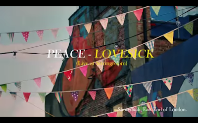

Peace: Lovesick Session
Peace, a indie band from Birmingham, played a few songs of their debut album in a session sponsored by Corona. I really like the cinematic style the videos have been given. Unlike most music videos all of the videos have an introduction which is made up of shots taken in London. Over the top each video has the bands name, the track they are playing and the venue name. Text:
The font used is the same that the band use for their albums. The album to the right is the bands debut, In Love. Obviously the font has been copied and the use of colour on the text has also been emulated. The only difference is that the text on the album cover looks to be in bold whereas the session video has been left regular. By having the same font and colour across the two pieces it creates continuity and further reinforces the bands brand. It also alludes to a certain ethos, that even when collaborating with others Peace use their brand and their styling.
Shot(s):
The shots used behind the text are street scene shots taken in Shoreditch, London.
Wednesday, 21 October 2015
Pitch
Chosen Track:
The track I have chosen to use is one created by the band that I play in. The reason I have done this is because for a performance video to look genuine the track should be something that the band is comfortable playing. Obviously if I tried to portray my band as the Arctic Monkeys it wouldn't look at all legitimate because most of my peers and target audience know who the Arctic Monkeys are and what they look like. Therefore because the actors I am using are the band members that made the track from a audience perspective it should look far more legitimate. The track is stylistically alternative/downtempo-jazz . Therefore the video doesn't have to comply with the conventions of pop music. By being alternative it means that the video can break rules and be made how I want it to.Style Of Video:
Stylistically my video is a split of two types. It will be part performance, part abstract footage. the abstract footage will be shot in New York. Obviously there doesn't have to be a direct tie between New York and the band or music that I am using. Instead the primary reason for me wanting to shoot in New York is because there will be a lot of opportunities to get stunning sequences. Beyond that there are more ties but they are all secondary to the primary. For example, the music is focused on a star. Therefore having everyday shots of people moving through a city conveys the notion that the band are the same as everyday people. Also because of the genre there are historic links between the music and New York. Another reason is because of the heavy iconography embedded within every aspect or New York, the portrayal of which will aid the presentation of my video.Inspirations/Intertextual References:
Obviously there are numerous inspirations that have subtly influenced my thought process however there are more notable intertextual references that I have listed on my Intertextual References post.
Subverting/Challenging of Conventions:
My video will do a mixture of challenging and conforming to the conventions of music videos. For example, in band based music there are often a lot of shots of the band creating a star image for the whole group rather than just the frontman. In that sense I will be complying to the conventions. Another convention that I will follow is that of having the video cut to the beat of the music. Obviously my track doesn't have vocals therefore it would be best to use the other areas where the video and music can link.
Target Audience:
The target audience for my video will be mixed. At current I'm putting together a survey to better find out who my video will appeal to
Star Image:
As stated above, my star image will be focused on the whole band. Unlike a pop performance or narrative video I will be trying to portray each member equally, without it looking too contrived. In band based music and videos although the band are often fairly equally portrayed, the frontman os the band will often be more of a recognisable icon than the bass player or drummer.
Tuesday, 20 October 2015
Magazine Advert Research
Alongside the digipak and the music video I am producing an advert with the intended context as a magazine. For this I have analysed a range of adverts to draw influence from. With the examples that I have analysed I have tried to pick adverts for the albums that I analysed in the digipak research. By doing this I can analyse the continuity across both mediums. Obviously continuity is what I want to have within my work. By giving all of the products a continuos aesthetic it means that they become a brand which then gains an identity for the whole body of work. It also means that if audience members were to see the advert in a magazine and then be in a shop and see the album they would recognise the two and subconsciously join the two.
 The artwork for this advert is a photo of Lana Del Rey lighting a cigarette. Compositionally Del Rey is centered to show that she I important. Obviously the connotation of having her center frame is that she is the center of attention. To add to this she has her eyes closed. This shows that whilst the audience is being made to look at her she doesn't care and is in her own world because she is the star. This links to the shot of Del Rey on the back cover of the Ultraviolence digipak. In that she is shown in the center of the frame however she doesn't directly address the audience. Stylistically the advert links to the digipak. The photograph is black and white, however there is a slight difference. Del Rey's lips and lighter flame are in colour. By being selective with what parts are in colour and what parts aren't it draws attention to the advert as readers flick through the magazines that it would of been featured in. Contextually magazines tend not be art pieces. Therefore from a colour standpoint they aren't selective or very creative. Therefore the advert creates contrast causing it to stand out and have a higher level of impact. Also the blacks have a faded muted tone which has the connotations of a vintage photograph. Obviously across all branding Lana Del Rey tends to go for this look in varying levels, so this advert is a continuation of her aesthetic. Del Rey is wearing what looks to be a studded leather jacket. By wearing a leather jacket it gives the image the connotations of the heritage leather jackets have. For example I have included a photo of Keith Richards wearing one in 1972. Keith is obviously a rock star in the truest sense of the term. He's one of the guitarists for possibly the biggest rock band of all time, the Rolling Stones. This shot was taken in 1972, which is 42 years before Del Rey donned the leather jacket for the advert, demonstrates the heritage and history that they have. Therefore by Del Rey wearing a similar jacket she evokes the same connotations. Obviously the cigarette works in a similar way. Despite the negative health impact smoking cigarettes is still seen as very cool and rock and roll. Above I have included a photo of Kurt Cobain, the deceased Nirvanna front man, smoking a cigarette whilst playing guitar onstage. It is easy to see how due to these cultural figures smoking it becomes trendy to do so. And due to this picturing Del Rey lighting up draws on these connotations. Added to this is the fact that she is pictured lighting up, therefore there is a flame which the connotations of which are danger. By making Del Rey appear dangerous she further cultivates the slightly anti-hero outlaw image that she seems to be going for.
 The text that has ben used is minimal. All of the key information that the audience need to retain in order to purchase the product is written in red. The secondary text has been put in a thinner font and has been coloured in white. The text beneath the title mentions the hit singles from the album. By doing this they entice the audience who may have heard the singles. In some cases the singles will be released prior to the full album and therefore they may already have an audience who then are drawn in by the reference on the poster. At the bottom there are three logos/items. The first is the Amazon logo. Presumably there has been a deal made between Amazon and the record label. By paying to have their logo on the adverts the audience are more likely to think about buying the album from that retailer. Also the Amazon logo has been left in true colour. It hasn't been made to comply with the colour scheme across the rest of the advert. Instead it is in white and orange. By doing this it is bound to stand out more. The next piece of text is Del Rey's website. Obviously there will be tour information and album information on her website which is crucial to transaction and information process. The last logo on the poster is the record labels logo.
To me The 1975 are kings of aesthetic. Across all outputs, fashion, album art, poster, live lighting and more they manage to produce a cohesive image. For this analysis I have chosen a tour advert. It is relevant because the tour is supporting the release of the album.
 Lana Del Rey: Ultraviolence
Artwork:
The artwork for this advert is a photo of Lana Del Rey lighting a cigarette. Compositionally Del Rey is centered to show that she I important. Obviously the connotation of having her center frame is that she is the center of attention. To add to this she has her eyes closed. This shows that whilst the audience is being made to look at her she doesn't care and is in her own world because she is the star. This links to the shot of Del Rey on the back cover of the Ultraviolence digipak. In that she is shown in the center of the frame however she doesn't directly address the audience. Stylistically the advert links to the digipak. The photograph is black and white, however there is a slight difference. Del Rey's lips and lighter flame are in colour. By being selective with what parts are in colour and what parts aren't it draws attention to the advert as readers flick through the magazines that it would of been featured in. Contextually magazines tend not be art pieces. Therefore from a colour standpoint they aren't selective or very creative. Therefore the advert creates contrast causing it to stand out and have a higher level of impact. Also the blacks have a faded muted tone which has the connotations of a vintage photograph. Obviously across all branding Lana Del Rey tends to go for this look in varying levels, so this advert is a continuation of her aesthetic. Del Rey is wearing what looks to be a studded leather jacket. By wearing a leather jacket it gives the image the connotations of the heritage leather jackets have. For example I have included a photo of Keith Richards wearing one in 1972. Keith is obviously a rock star in the truest sense of the term. He's one of the guitarists for possibly the biggest rock band of all time, the Rolling Stones. This shot was taken in 1972, which is 42 years before Del Rey donned the leather jacket for the advert, demonstrates the heritage and history that they have. Therefore by Del Rey wearing a similar jacket she evokes the same connotations. Obviously the cigarette works in a similar way. Despite the negative health impact smoking cigarettes is still seen as very cool and rock and roll. Above I have included a photo of Kurt Cobain, the deceased Nirvanna front man, smoking a cigarette whilst playing guitar onstage. It is easy to see how due to these cultural figures smoking it becomes trendy to do so. And due to this picturing Del Rey lighting up draws on these connotations. Added to this is the fact that she is pictured lighting up, therefore there is a flame which the connotations of which are danger. By making Del Rey appear dangerous she further cultivates the slightly anti-hero outlaw image that she seems to be going for. Text:
The text that has ben used is minimal. All of the key information that the audience need to retain in order to purchase the product is written in red. The secondary text has been put in a thinner font and has been coloured in white. The text beneath the title mentions the hit singles from the album. By doing this they entice the audience who may have heard the singles. In some cases the singles will be released prior to the full album and therefore they may already have an audience who then are drawn in by the reference on the poster. At the bottom there are three logos/items. The first is the Amazon logo. Presumably there has been a deal made between Amazon and the record label. By paying to have their logo on the adverts the audience are more likely to think about buying the album from that retailer. Also the Amazon logo has been left in true colour. It hasn't been made to comply with the colour scheme across the rest of the advert. Instead it is in white and orange. By doing this it is bound to stand out more. The next piece of text is Del Rey's website. Obviously there will be tour information and album information on her website which is crucial to transaction and information process. The last logo on the poster is the record labels logo.
 Peace: Happy People
Artwork:
The artwork for the advert is based around the digipak artwork. Obviously in the center of the advert there is the bands logo. It has been edited to contain them, which is how the artwork on the digipak looks. Therefore they obviously are drawing links between both of the products. And by having a advert that is styled around the digipak the audience is more likely to draw links between the two products. Added to this is that after seeing the advert the audience members will likely remember the artwork and therefore when they are in shops they are more likely to recognise the artwork and therefore may be more likely to make a purchase.
Text:
The text on the advert has been separated in two sections. The top section is the bands name and the tour promoters name. The bottom section is all of the relevant information needed for the audience member to make a purchase. The first line of the bottom half includes the album name stating the fact that the album is "Out Now". Directly beneath
The 1975: Love Me
To me The 1975 are kings of aesthetic. Across all outputs, fashion, album art, poster, live lighting and more they manage to produce a cohesive image. For this analysis I have chosen a tour advert. It is relevant because the tour is supporting the release of the album.
Artwork:
The artwork on this advert is the cover for the album that the band will be touring. By doing that the band are clearly making a link between the advert and the product that is on sale. Like the digipak the poster has kept to a minimal colour scheme based on a select range of pastel tones. By being selective with the colours used they have managed to identify their brand and give it a stylised look instead of a muddled unfocused look. By being so white based and having such a light presence it would stand out in a magazine as it would contrast with the jumbled crammed pages that occupy the rest of the magazine. Therefore the advert draws attention too itself.
Text:
The text on the advert is very rigidly formatted. Each tour date has been separated by a line in the same colour as the city information. The rest of the text has been put in the muted turquoise grey tone seen along the bottom of the section of the digipak artwork. The text at the top of the advert is the bands name, the date of the tour and the fact that it is a tour. The text at the bottom of the advert is the record label name, the bands website and the names of the promotors and companies that are involved with the management of the band. On a whole the text included is very minimal and selective.
Conclusion:
Overall I really like this advert as it has a really strong aesthetic that is in keeping and consistent with the rest of the bands imagery and most importantly the digipak artwork. I really like the minimal approach as it gives the advert a fresh look. The bold looking album art coupled with the strong font means that the advert has a very graphic aesthetic that may not be entirely appropriate for my artwork. However I can still draw influence from the coherent aesthetic that runs across the digipak and the advert.
Subscribe to:
Comments (Atom)