Alongside the digipak and the music video I am producing an advert with the intended context as a magazine. For this I have analysed a range of adverts to draw influence from. With the examples that I have analysed I have tried to pick adverts for the albums that I analysed in the digipak research. By doing this I can analyse the continuity across both mediums. Obviously continuity is what I want to have within my work. By giving all of the products a continuos aesthetic it means that they become a brand which then gains an identity for the whole body of work. It also means that if audience members were to see the advert in a magazine and then be in a shop and see the album they would recognise the two and subconsciously join the two.
 The artwork for this advert is a photo of Lana Del Rey lighting a cigarette. Compositionally Del Rey is centered to show that she I important. Obviously the connotation of having her center frame is that she is the center of attention. To add to this she has her eyes closed. This shows that whilst the audience is being made to look at her she doesn't care and is in her own world because she is the star. This links to the shot of Del Rey on the back cover of the Ultraviolence digipak. In that she is shown in the center of the frame however she doesn't directly address the audience. Stylistically the advert links to the digipak. The photograph is black and white, however there is a slight difference. Del Rey's lips and lighter flame are in colour. By being selective with what parts are in colour and what parts aren't it draws attention to the advert as readers flick through the magazines that it would of been featured in. Contextually magazines tend not be art pieces. Therefore from a colour standpoint they aren't selective or very creative. Therefore the advert creates contrast causing it to stand out and have a higher level of impact. Also the blacks have a faded muted tone which has the connotations of a vintage photograph. Obviously across all branding Lana Del Rey tends to go for this look in varying levels, so this advert is a continuation of her aesthetic. Del Rey is wearing what looks to be a studded leather jacket. By wearing a leather jacket it gives the image the connotations of the heritage leather jackets have. For example I have included a photo of Keith Richards wearing one in 1972. Keith is obviously a rock star in the truest sense of the term. He's one of the guitarists for possibly the biggest rock band of all time, the Rolling Stones. This shot was taken in 1972, which is 42 years before Del Rey donned the leather jacket for the advert, demonstrates the heritage and history that they have. Therefore by Del Rey wearing a similar jacket she evokes the same connotations. Obviously the cigarette works in a similar way. Despite the negative health impact smoking cigarettes is still seen as very cool and rock and roll. Above I have included a photo of Kurt Cobain, the deceased Nirvanna front man, smoking a cigarette whilst playing guitar onstage. It is easy to see how due to these cultural figures smoking it becomes trendy to do so. And due to this picturing Del Rey lighting up draws on these connotations. Added to this is the fact that she is pictured lighting up, therefore there is a flame which the connotations of which are danger. By making Del Rey appear dangerous she further cultivates the slightly anti-hero outlaw image that she seems to be going for.
 The text that has ben used is minimal. All of the key information that the audience need to retain in order to purchase the product is written in red. The secondary text has been put in a thinner font and has been coloured in white. The text beneath the title mentions the hit singles from the album. By doing this they entice the audience who may have heard the singles. In some cases the singles will be released prior to the full album and therefore they may already have an audience who then are drawn in by the reference on the poster. At the bottom there are three logos/items. The first is the Amazon logo. Presumably there has been a deal made between Amazon and the record label. By paying to have their logo on the adverts the audience are more likely to think about buying the album from that retailer. Also the Amazon logo has been left in true colour. It hasn't been made to comply with the colour scheme across the rest of the advert. Instead it is in white and orange. By doing this it is bound to stand out more. The next piece of text is Del Rey's website. Obviously there will be tour information and album information on her website which is crucial to transaction and information process. The last logo on the poster is the record labels logo.
To me The 1975 are kings of aesthetic. Across all outputs, fashion, album art, poster, live lighting and more they manage to produce a cohesive image. For this analysis I have chosen a tour advert. It is relevant because the tour is supporting the release of the album.
 Lana Del Rey: Ultraviolence
Artwork:
The artwork for this advert is a photo of Lana Del Rey lighting a cigarette. Compositionally Del Rey is centered to show that she I important. Obviously the connotation of having her center frame is that she is the center of attention. To add to this she has her eyes closed. This shows that whilst the audience is being made to look at her she doesn't care and is in her own world because she is the star. This links to the shot of Del Rey on the back cover of the Ultraviolence digipak. In that she is shown in the center of the frame however she doesn't directly address the audience. Stylistically the advert links to the digipak. The photograph is black and white, however there is a slight difference. Del Rey's lips and lighter flame are in colour. By being selective with what parts are in colour and what parts aren't it draws attention to the advert as readers flick through the magazines that it would of been featured in. Contextually magazines tend not be art pieces. Therefore from a colour standpoint they aren't selective or very creative. Therefore the advert creates contrast causing it to stand out and have a higher level of impact. Also the blacks have a faded muted tone which has the connotations of a vintage photograph. Obviously across all branding Lana Del Rey tends to go for this look in varying levels, so this advert is a continuation of her aesthetic. Del Rey is wearing what looks to be a studded leather jacket. By wearing a leather jacket it gives the image the connotations of the heritage leather jackets have. For example I have included a photo of Keith Richards wearing one in 1972. Keith is obviously a rock star in the truest sense of the term. He's one of the guitarists for possibly the biggest rock band of all time, the Rolling Stones. This shot was taken in 1972, which is 42 years before Del Rey donned the leather jacket for the advert, demonstrates the heritage and history that they have. Therefore by Del Rey wearing a similar jacket she evokes the same connotations. Obviously the cigarette works in a similar way. Despite the negative health impact smoking cigarettes is still seen as very cool and rock and roll. Above I have included a photo of Kurt Cobain, the deceased Nirvanna front man, smoking a cigarette whilst playing guitar onstage. It is easy to see how due to these cultural figures smoking it becomes trendy to do so. And due to this picturing Del Rey lighting up draws on these connotations. Added to this is the fact that she is pictured lighting up, therefore there is a flame which the connotations of which are danger. By making Del Rey appear dangerous she further cultivates the slightly anti-hero outlaw image that she seems to be going for. Text:
The text that has ben used is minimal. All of the key information that the audience need to retain in order to purchase the product is written in red. The secondary text has been put in a thinner font and has been coloured in white. The text beneath the title mentions the hit singles from the album. By doing this they entice the audience who may have heard the singles. In some cases the singles will be released prior to the full album and therefore they may already have an audience who then are drawn in by the reference on the poster. At the bottom there are three logos/items. The first is the Amazon logo. Presumably there has been a deal made between Amazon and the record label. By paying to have their logo on the adverts the audience are more likely to think about buying the album from that retailer. Also the Amazon logo has been left in true colour. It hasn't been made to comply with the colour scheme across the rest of the advert. Instead it is in white and orange. By doing this it is bound to stand out more. The next piece of text is Del Rey's website. Obviously there will be tour information and album information on her website which is crucial to transaction and information process. The last logo on the poster is the record labels logo.
 Peace: Happy People
Artwork:
The artwork for the advert is based around the digipak artwork. Obviously in the center of the advert there is the bands logo. It has been edited to contain them, which is how the artwork on the digipak looks. Therefore they obviously are drawing links between both of the products. And by having a advert that is styled around the digipak the audience is more likely to draw links between the two products. Added to this is that after seeing the advert the audience members will likely remember the artwork and therefore when they are in shops they are more likely to recognise the artwork and therefore may be more likely to make a purchase.
Text:
The text on the advert has been separated in two sections. The top section is the bands name and the tour promoters name. The bottom section is all of the relevant information needed for the audience member to make a purchase. The first line of the bottom half includes the album name stating the fact that the album is "Out Now". Directly beneath
The 1975: Love Me
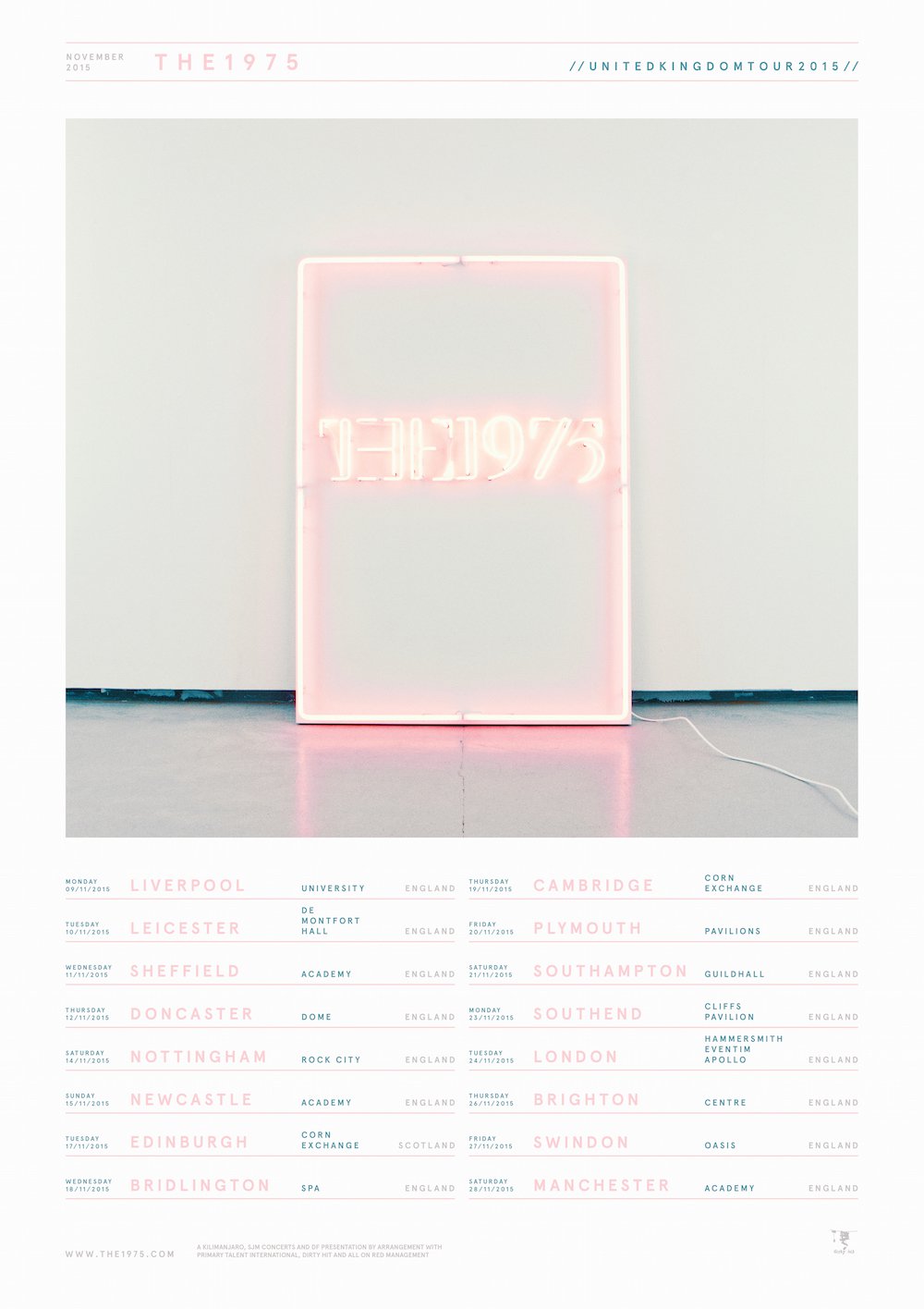
To me The 1975 are kings of aesthetic. Across all outputs, fashion, album art, poster, live lighting and more they manage to produce a cohesive image. For this analysis I have chosen a tour advert. It is relevant because the tour is supporting the release of the album.
Artwork:
The artwork on this advert is the cover for the album that the band will be touring. By doing that the band are clearly making a link between the advert and the product that is on sale. Like the digipak the poster has kept to a minimal colour scheme based on a select range of pastel tones. By being selective with the colours used they have managed to identify their brand and give it a stylised look instead of a muddled unfocused look. By being so white based and having such a light presence it would stand out in a magazine as it would contrast with the jumbled crammed pages that occupy the rest of the magazine. Therefore the advert draws attention too itself.
Text:
The text on the advert is very rigidly formatted. Each tour date has been separated by a line in the same colour as the city information. The rest of the text has been put in the muted turquoise grey tone seen along the bottom of the section of the digipak artwork. The text at the top of the advert is the bands name, the date of the tour and the fact that it is a tour. The text at the bottom of the advert is the record label name, the bands website and the names of the promotors and companies that are involved with the management of the band. On a whole the text included is very minimal and selective.
Conclusion:
Overall I really like this advert as it has a really strong aesthetic that is in keeping and consistent with the rest of the bands imagery and most importantly the digipak artwork. I really like the minimal approach as it gives the advert a fresh look. The bold looking album art coupled with the strong font means that the advert has a very graphic aesthetic that may not be entirely appropriate for my artwork. However I can still draw influence from the coherent aesthetic that runs across the digipak and the advert.