Obviously my video needs to somehow introduce the band and potentially the track name. On YouTube the information will be beneath the video, however because I am going for a more artistic approach I want to make sure every element of the execution of the video is taken into account. Also because I am adapting a more cinematic look I want to include some form of introduction and after some consideration I've realised that a title or introduction screen would work best. Because of this, I have analysed some examples that I want to draw influence from.
 Peace, a indie band from Birmingham, played a few songs of their debut album in a session sponsored by Corona. I really like the cinematic style the videos have been given. Unlike most music videos all of the videos have an introduction which is made up of shots taken in London. Over the top each video has the bands name, the track they are playing and the venue name.
 Gengahr: Tour Video

Gengahr, a North London band, produced a tour video. The video primarily consisted of nicely shot clips sequenced together from the tour the band went on supporting Alt-J. I really like the very plain graphic look of the title. It simply introduces the band and what the video is about without anything extra or less. Also the way the text gets added to the screen being synced with the sound of the drummer, Danny Ward, sound checking a snare drum makes a really strong effect. Also the way the title is put on top of a pretty abstract piece of footage creates a preemptive notion, as though the audience should expect something big to come next. Because the snare sound has been recorded in a big room with reverb it creates a suspense feel because although the audience may not be consciously aware of the fact that a big room causes big amounts of reverb they still get the suspense. Added to that the way the snare is played has an almost military like sound.
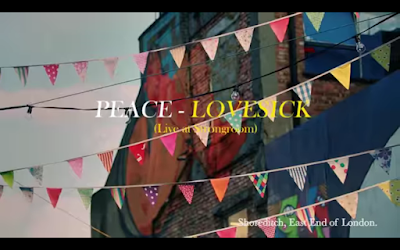

Peace: Lovesick Session
Peace, a indie band from Birmingham, played a few songs of their debut album in a session sponsored by Corona. I really like the cinematic style the videos have been given. Unlike most music videos all of the videos have an introduction which is made up of shots taken in London. Over the top each video has the bands name, the track they are playing and the venue name. Text:
The font used is the same that the band use for their albums. The album to the right is the bands debut, In Love. Obviously the font has been copied and the use of colour on the text has also been emulated. The only difference is that the text on the album cover looks to be in bold whereas the session video has been left regular. By having the same font and colour across the two pieces it creates continuity and further reinforces the bands brand. It also alludes to a certain ethos, that even when collaborating with others Peace use their brand and their styling.
Shot(s):
The shots used behind the text are street scene shots taken in Shoreditch, London.