Wednesday, 21 October 2015

Pitch


Chosen Track:

The track I have chosen to use is one created by the band that I play in. The reason I have done this is because for a performance video to look genuine the track should be something that the band is comfortable playing. Obviously if I tried to portray my band as the Arctic Monkeys it wouldn't look at all legitimate because most of my peers and target audience know who the Arctic Monkeys are and what they look like. Therefore because the actors I am using are the band members that made the track from a audience perspective it should look far more legitimate. The track is stylistically alternative/downtempo-jazz . Therefore the video doesn't have to comply with the conventions of pop music. By being alternative it means that the video can break rules and be made how I want it to.


Style Of Video:

Stylistically my video is a split of two types. It will be part performance, part abstract footage. the abstract footage will be shot in New York. Obviously there doesn't have to be a direct tie between New York and the band or music that I am using. Instead the primary reason for me wanting to shoot in New York is because there will be a lot of opportunities to get stunning sequences. Beyond that there are more ties but they are all secondary to the primary. For example, the music is focused on a star. Therefore having everyday shots of people moving through a city conveys the notion that the band are the same as everyday people. Also because of the genre there are historic links between the music and New York. Another reason is because of the heavy iconography embedded within every aspect or New York, the portrayal of which will aid the presentation of my video.

Inspirations/Intertextual References:

Obviously there are numerous inspirations that have subtly influenced my thought process however there are more notable intertextual references that I have listed on my Intertextual References post.


Subverting/Challenging of Conventions:

My video will do a mixture of challenging and conforming to the conventions of music videos. For example, in band based music there are often a lot of shots of the band creating a star image for the whole group rather than just the frontman. In that sense I will be complying to the conventions. Another convention that I will follow is that of having the video cut to the beat of the music. Obviously my track doesn't have vocals therefore it would be best to use the other areas where the video and music can link.

Target Audience:

The target audience for my video will be mixed. At current I'm putting together a survey to better find out who my video will appeal to

Star Image:

As stated above, my star image will be focused on the whole band. Unlike a pop performance or narrative video I will be trying to portray each member equally, without it looking too contrived. In band based music and videos although the band are often fairly equally portrayed, the frontman os the band will often be more of a recognisable icon than the bass player or drummer.


Tuesday, 20 October 2015

Magazine Advert Research

Alongside the digipak and the music video I am producing an advert with the intended context as a magazine. For this I have analysed a range of adverts to draw influence from. With the examples that I have analysed I have tried to pick adverts for the albums that I analysed in the digipak research. By doing this I can analyse the continuity across both mediums. Obviously continuity is what I want to have within my work. By giving all of the products a continuos aesthetic it means that they become a brand which then gains an identity for the whole body of work. It also means that if audience members were to see the advert in a magazine and then be in a shop and see the album they would recognise the two and subconsciously join the two.

Lana Del Rey: Ultraviolence


Artwork:


The artwork for this advert is a photo of Lana Del Rey lighting a cigarette. Compositionally Del Rey is centered to show that she I important. Obviously the connotation of having her center frame is that she is the center of attention. To add to this she has her eyes closed. This shows that whilst the audience is being made to look at her she doesn't care and is in her own world because she is the star. This links to the shot of Del Rey on the back cover of the Ultraviolence digipak. In that she is shown in the center of the frame however she doesn't directly address the audience. Stylistically the advert links to the digipak. The photograph is black and white, however there is a slight difference. Del Rey's lips and lighter flame are in colour. By being selective with what parts are in colour and what parts aren't it draws attention to the advert as readers flick through the magazines that it would of been featured in. Contextually magazines tend not be art pieces. Therefore from a colour standpoint they aren't selective or very creative. Therefore the advert creates contrast causing it to stand out and have a higher level of impact. Also the blacks have a faded muted tone which has the connotations of a vintage photograph. Obviously across all branding Lana Del Rey tends to go for this look in varying levels, so this advert is a continuation of her aesthetic. Del Rey is wearing what looks to be a studded leather jacket. By wearing a leather jacket it gives the image the connotations of the heritage leather jackets have. For example I have included a photo of Keith Richards wearing one in 1972. Keith is obviously a rock star in the truest sense of the term. He's one of the guitarists for possibly the biggest rock band of all time, the Rolling Stones. This shot was taken in 1972, which is 42 years before Del Rey donned the leather jacket for the advert, demonstrates the heritage and history that they have. Therefore by Del Rey wearing a similar jacket she evokes the same connotations. Obviously the cigarette works in a similar way. Despite the negative health impact smoking cigarettes is still seen as very cool and rock and roll. Above I have included a photo of Kurt Cobain, the deceased Nirvanna front man, smoking a cigarette whilst playing guitar onstage. It is easy to see how due to these cultural figures smoking it becomes trendy to do so. And due to this picturing Del Rey lighting up draws on these connotations. Added to this is the fact that she is pictured lighting up, therefore there is a flame which the connotations of which are danger. By making Del Rey appear dangerous she further cultivates the slightly anti-hero outlaw image that she seems to be going for. 


Text:

The text that has ben used is minimal. All of the key information that the audience need to retain in order to purchase the product is written in red. The secondary text has been put in a thinner font and has been coloured in white. The text beneath the title mentions the hit singles from the album. By doing this they entice the audience who may have heard the singles. In some cases the singles will be released prior to the full album and therefore they may already have an audience who then are drawn in by the reference on the poster. At the bottom there are three logos/items. The first is the Amazon logo. Presumably there has been a deal made between Amazon and the record label. By paying to have their logo on the adverts the audience are more likely to think about buying the album from that retailer. Also the Amazon logo has been left in true colour. It hasn't been made to comply with the colour scheme across the rest of the advert. Instead it is in white and orange. By doing this it is bound to stand out more. The next piece of text is Del Rey's website. Obviously there will be tour information and album information on her website which is crucial to transaction and information process. The last logo on the poster is the record labels logo.


Peace: Happy People

Artwork:

The artwork for the advert is based around the digipak artwork. Obviously in the center of the advert there is the bands logo. It has been edited to contain them, which is how the artwork on the digipak looks. Therefore they obviously are drawing links between both of the products. And by having a advert that is styled around the digipak the audience is more likely to draw links between the two products. Added to this is that after seeing the advert the audience members will likely remember the artwork and therefore when they are in shops they are more likely to recognise the artwork and therefore may be more likely to make a purchase.

Text:

The text on the advert has been separated in two sections. The top section is the bands name and the tour promoters name. The bottom section is all of the relevant information needed for the audience member to make a purchase. The first line of the bottom half includes the album name stating the fact that the album is "Out Now". Directly beneath 

The 1975: Love Me


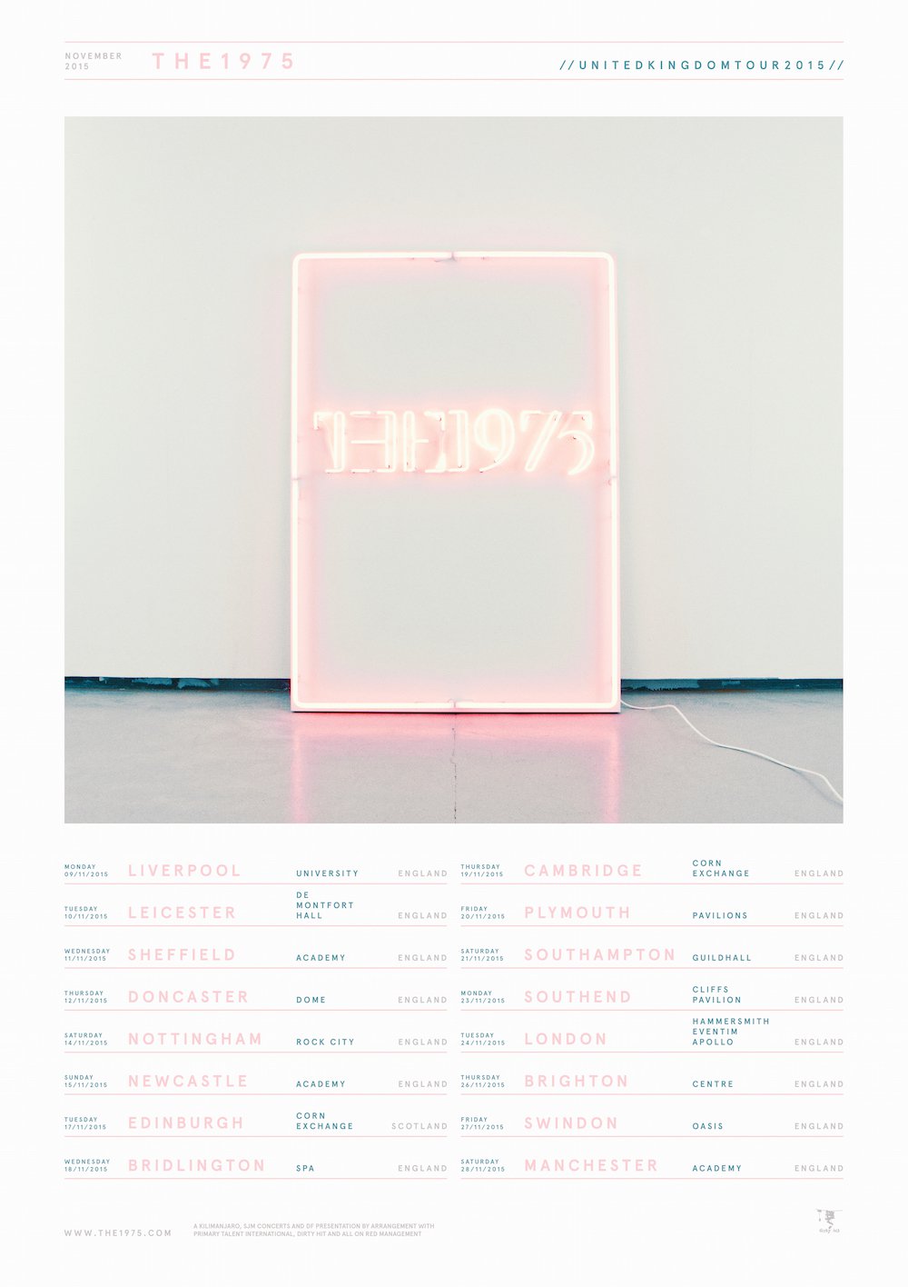
To me The 1975 are kings of aesthetic. Across all outputs, fashion, album art, poster, live lighting and more they manage to produce a cohesive image. For this analysis I have chosen a tour advert. It is relevant because the tour is supporting the release of the album.

Artwork:

The artwork on this advert is the cover for the album that the band will be touring. By doing that the band are clearly making a link between the advert and the product that is on sale. Like the digipak the poster has kept to a minimal colour scheme based on a select range of pastel tones. By being selective with the colours used they have managed to identify their brand and give it a stylised look instead of a muddled unfocused look. By being so white based and having such a light presence it would stand out in a magazine as it would contrast with the jumbled crammed pages that occupy the rest of the magazine. Therefore the advert draws attention too itself. 

Text:

The text on the advert is very rigidly formatted. Each tour date has been separated by a line in the same colour as the city information. The rest of the text has been put in the muted turquoise grey tone seen along the bottom of the section of the digipak artwork. The text at the top of the advert is the bands name, the date of the tour and the fact that it is a tour. The text at the bottom of the advert is the record label name, the bands website and the names of the promotors and companies that are involved with the management of the band. On a whole the text included is very minimal and selective.

Conclusion:

Overall I really like this advert as it has a really strong aesthetic that is in keeping and consistent with the rest of the bands imagery and most importantly the digipak artwork. I really like the minimal approach as it gives the advert a fresh look. The bold looking album art coupled with the strong font means that the advert has a very graphic aesthetic that may not be entirely appropriate for my artwork. However I can still draw influence from the coherent aesthetic that runs across the digipak and the advert.

Thursday, 15 October 2015

Digipak Planning

After researching digipaks I have now started to develop some ideas for my digipak. Below I have detailed some of my concepts.

Cover:

Recently I have been reading up on the work of the artist Wes Lang. He produces large scale pieces of work that reference American history and ideology. I really like both his approach to his art and the pieces that his process creates. He has a very loose expressive approach to defining the shapes and adding tone. I also really like the subject matter and the portrayal. For me the association of skulls and reapers is a negative one. Not just because of what they mean but the aesthetic that accompanies them within the culture that surrounds me. To me because Wes Lang operates in America it his drawings of skulls etc don't have the more dark and heavy connotations they do in England. For example in England the iconography that Lang works with is associated with music and culture such as Black Sabbath and Satanism. Not that there is anything wrong with either but they aren't emotions or thoughts that I want to evoke within my work. They also aren't relevant to the genre of music that my track is. Black Sabbath is credited as one of the first Heavy Metal bands. Obviously my track is more jazz based, therefore drawing on the same imagery would be inappropriate. However as I hinted too earlier I feel that Lang manages to reference these darker subjects whilst not referencing the connotations that I want to avoid.


Concept:

Art:

On the right is a sketch of my cover art concept. To briefly explain it, there is a large piece of paper with a Lang inspired painting/drawing hanging on a white brick wall. It is down lit by a ceiling light. Obviously that couldn't just be the artwork. I would have to actually capture the scene somehow. To do this I would use my DSLR shooting in a RAW .NEF file format to capture the most information so that I could then edit the image in Photoshop to give it a vintage 35mm look. This would make it look like Ultraviolence by Lana Del Rey, one of the digipak's that I analysed.

Text:

The bands name would be painted on the bottom with the paint left to drip so that it had a very loose expressive feel. Music is all about expression and emotion and for me I think to put the name in Arial Black over the top would look inappropriate.

Model:

As I was developing my concept I had another idea. Instead of just having the painting/drawing hanging up I would have a female model standing in front of it to the left looking at the painting and away from the camera. The model would would be topless, but due to her looking away the audience would only see her bare back. This would add a human element to my design. Both female and male bodies are beautiful and so to compliment the artwork having a stunning example of the human form on the cover could really enhance my design. Also I would want my model to be standing holding a dripping paintbrush. By doing this it would appear as though they had just painted this large piece on the wall in a very expressive way. Within my art I am conscious of the fact that so much of it revolves around me being sat at a desk working on A4 white paper. By having the artwork big, hanging up and presented as though it had been produced in a fit of emotional release it would represent the music which was an improvised jam that occurred at a rehearsal. Another connotation of having the model topless is freedom. Freedom to express themself how they choose and in this case the freedom to produce art in a way that they feel comfortable. This links with the American ideology that I am subliminally linking throughout all of the products. 

Stylistically I would be referencing the work of the photographer Henrik Purienne. The photo on the right is an example of Purienne's work showing a model in a similar pose to the one I am planning on using. Some of his work can be very NSFW with barely any of the model covered, and in some shots none. However some of his more soft or tame work to me is just beautiful photography artfully depicting the beauty of women, which should be seen as an empowering theme rather than a sexist or sexualised message. Symbols only have the meanings that we attach to them. For example The rapper Tyler The Creator has said he doesn't feel offended when he hears the "N word". In interviews the interviewer often seems puzzled by this concept. However when Tyler goes on to explain how words are just words and there is no point getting offended by them it makes sense in a way that directly relates the criticism and issues I may encounter if I chose to have a model on my digipak. The actress and model Emily Ratajkowski, who most people recognise from the music video for Blurred Lines, has said when questioned on the video that nudity doesn't have to mean anything "exploitative". This is a viewpoint that I strongly agree with. Too often audiences of products view images or symbols in such a conservative manor. When as an audience member you step back and examine what is actually on show there is nothing to be afraid or scared of. 

Because of the angle of camera in relation to the model it wouldn't have a trashy glamour photography style. Not that glamour photography is inherently trashy, but often the famous examples of it are unadulterated eroticism, ninety percent of which is aimed at a male market. Because of this any nudity in photography tends to have negative connotations amongst those who can't look at it from an artistic stand point. Therefore by having my model face away from the camera the sexual element has been removed and instead it has become an artistic statement. Obviously to some it still may seem sexual, however at that point there will be less of the models body visible than the majority of beach goers in hot countries. Also I would focus my camera so that the artwork is in focus and the model would be slightly out of focus. 

In a general address to the class my teacher spoke about how adult content may not be seen as appropriate in our work and that in some cases the exam board had sent back work because they felt that it crossed the boundary. Obviously this is an issue that I do not want to encounter therefore if I feel there is a high probability of it causing an issue I would remove the model from the shot by replacing the image with a shot without the model in frame. In my eyes that would be a shame because I am eighteen, therefore legally an adult, and provided I had signed consent waivers  it seems crazy that given my lengthy discussion and justification my vision would be censored. At the end of the day although A-Levels are qualifications they are there too school students in how to produce or work in a way that will benefit them and society. Therefore by applying censorship and restrictions that don't exist in the outside world it gives a false sense of limitation. To the above right I have included a screenshot from music video for Girls by The 1975. Obviously there are four women in nothing but underwear on a very brightly lit set. This just proves that in reality if its relevant to the creative product there is a place for selective nudity. My project is actually a live brief anyway because the band whose track I am using will be potentially using this once my coursework is completed. Therefore it would be ludicrous to filter out some of the concept. And due to the fact that my concept isn't coming from a gratuitous standpoint I would strongly urge anyone who has any negative thoughts about try to understand the viewpoint I am writing from.


Centerfold:

I am currently working as a freelance photographer specialising in live music photography. Recently I shot an indie band called Peace. When I was editing the shots one of them struck me as a perfect example of how I could put together the centerfold. It is a shot of the guitarist Douglas Castle leaning forward to edit the settings on his effects pedals. Because he is focusing on the pedals he doesn't directly address the audience, therefore the fourth wall remains in contact. This is how I would get my actors to pose. Because Douglas hasn't addressed the audience it presents the idea that he doesn't care about their presence and is instead focused on the music in his world. These connotations are ones that I want to imply because, as stated numerous times throughout this blog, the genre doesn't require my stars to take the pop star approach. Instead they should appear to be operating within their world. This means that the digipak is like a piece of the the secretive world that they live in. This therefore makes the presentation more enticing to the audience because it acts as a souvenir from a place that they cant visit. To achieve this effect colour wise I had to use the colour balance tool on photoshop and up the red channels. This is a technique I am thinking of using on the video. By doing this on the video and digipak I would be creating a certain level of continuity within my products.

For my photo I intend to capture the main guitarist on the track, Youness Elharrak, in the same pose. To make sure he doesn't feel at all awkward, and to therefore avoid having a contrived looking shot I will intentionally change the settings on his effects pedals and then bring my camera out under the proviso that I'm just taking test shots. Therefore I should be able to capture Youness in action in a way that wont feel contrived or fake.

Originally my intention was to have the photo spread across the centerfold. After some thought about how it would follow after the cover I decided that it would look better if it was printed of and taped onto one of the white walls in the same room that the cover art would be set in. Therefore there would be continuity like with Ultraviolence. Also by taping it to the wall it has a slightly more organic feel.

Text:

Because I want to focus on the photography and the overall art created I wont be having any text over the top of the picture. In my mind that would detract from the impact of the shot.

Rearcover:

For the rearcover I want to keep up the continuity by photographing it on the same set as the front and the centerfold. For this it will be the same wall as the front however this time the painting/drawing wont be hanging on the wall. Instead of having paint bottles and cans along the bottom of the wall like on the front cover I would have them all in a cardboard box in the center of the frame. I haven't decided as to weather the model would be in the shot yet. There are two options and at this point I haven't yet decided. They are, to have the model not in the shot and to have the model in the shot, but presented in a different way to the cover. My idea is that the model would be seen fully clothed in this shot looking at the camera whilst running her hand through her hair. I would have her wearing mostly black and wearing a leather jacket. This would reference the heritage of the leather jacket which has a lot of embedded iconography. It would also reveal the mysterious cover star. By having her fully clothed it would also go along with the idea of having the wall clear and the paints tidied away. It would give the whole piece a feel of being temporary. Everything in life is temporary and on one hand music lasts for eternity but on the other once a note is played it is never played the same way again.

Text:

Because of how simple the image would be I would paint the track names and either have them taped to the wall on a piece of paper or I would use a scanner and add them using Photoshop. Either way they would be in keeping with the font on the front cover whilst also not detracting from the scene being portrayed in the photograph. 

Barcode:

The barcode would be small like the one on Ultraviolence. I wouldn't want it detracting from the art.

Conclusion:

Overall I feel conceptually my ideas are coherent and consistent. I think that if I can pull it off and convey the concept that is in my head the digipak would really aid the music and the music video.

Digipak Research

For this research I have examined some examples from different genres. I don't own any digipaks from the genre of my chosen track, however this shouldn't be an issue as although stylistically my track is jazz with the video, costume and digipak I am trying to break the stereotypes and norms of the genre.

Lana Del Rey: Ultraviolence

Ultraviolence is the third studio album by Lana Del Rey. Aside from the fact that I think musically the album is great, the artwork and presentation is also perfectly put together. It is in keeping with the rest of Del Rey's work and her image whilst also being an artfully presented piece. 

Cover:

The text on the cover is in the same style as Del Rey's other albums, Lana Del Ray and Born To Die. The same font has been used. However unlike previous albums the artists name isn't included. The font that has been used is very bold and striking. Therefore it clearly conveys the relevant information in the most effective way possible.

The artwork on the cover is a shot of Del Rey exciting her Mercedes Benz SL dressed all in white. To own a Mercedes implies a certain level of success and wealth. Although it isn't a Ferrari that particular model Mercedes is a cult classic. It has hints of the golden era of film and music. For example other owners include Henrik Purienne. He is a fashion photographer who is famous for his signature snapshot aesthetic. With connotations such as that it is no wonder why Del Rey chose to be photographed next to that car. The shot has been done in black and white with the blacks in the shot being muted to give a slightly faded vintage esque look. This is in keeping with Del Reys persona as she constantly overtly and covertly references cultures from different time periods. Obviously because Del Rey is the star of the music she is pictured centre of the frame looking directly at the audience. This conveys the idea that the album is by her. For me I wont be doing this because the music I am working with is not at all pop. As a result the the people behind the music aren't pop-culture figures. Because the band aren't pop culture it isn't important to the target audience to identify them on their products.

Centerfold: 

For the centerfold Del Rey has opted for a black and white photo of Los Angeles. This is where Del Rey lives and the city is often the subject of her lyrics. Obviously before Del Rey L.A. had pop culture and alternative heritage. Not all of Del Reys audience will live there or will have visited it. For many people it is a unrealisable dream to move to L.A. Therefore by including a photo of it it adds iconography of the city of dreams. And by doing that Del Rey presents herself and her life as slightly unobtainable. Added to that is that the shot is taken from a vantage point, looking down over residential areas and buildings were everyday people work. Obviously this gives the view that Del Rey is sitting on the hill looking down on the rest of civilisation because she is presenting herself as subtly superior. I like the fact that the image is uninterrupted by any text. It is a more artistic approach to digipak artwork. I appreciate that because it makes the overall package more aesthetically pleasing. If it was covered in text and photos of the artist on every page it would bombard the viewer too much, in my opinion. This is an approach I will be adopting because, as I stated above, my music doesn't require the audience to be constantly reminded of what the artist looks like.

Rearcover:

For the rearcover Del Rey has opted for another simple black and white photograph of herself in her Mercedes. Becuase of the framing she isn't drawing as much attention to the car as she is on the cover. This has been done to imply that to her although the car has heritage and is beautiful it isn't as big a thing to own a vintage Mercedes to her as it would be to one of her average audience members. By presenting herself like this she adds to her star image by subtly separating herself from her audience. Unlike with the front cover she hasn't broken the fourth wall. This time she isn't directly addressing the audience. Like both the front and center the rearcover has been shot with a 35mm aesthetic. This could of been achieved either by using a 35mm film camera or by using a high quality DSLR with film grain (noise) added afterwards. Compositionally Del Rey is center of the frame with her head and upper body taking up most of the frame. The Text on the back is limited. Aside from the track names the only other text is the credits which have been placed in the bottom left corner so that they don't detract from the presentation of the star. The same technique has been used for the bar code. By placing it in the top right corner the rearcover includes all of the relevant information without it detracting from the artwork of it.

Conclusion:

Overall this is one of my favourite digipaks. I actually bought the physical copy in part due to the artful aesthetic that has been used to present the album. That shows the power of the digipak. To most people there is little difference between an mp3 file or the physical copy however with this album the aesthetic of the physical was so strong that it made me want to wait to travel to a shop and purchase the album. I really like the black and white photography. It has a very classy vintage look. This aesthetic is steeped in connotations such as sixties and seventies rock musicians. However I am not sure if this will be appropriate for my artwork. Because I will be utilising colour in a really controlled way for the video it makes sense that the artwork reflects that. Otherwise the continuity would be lacking and therefore the overall presentation of the products would be weakened. I am thinking of using the same technique on my centrefold because it is appropriate for my artwork due to the more artistic style it has. 

Shoot Checklist

Below I have compiled a simple definitive checklist for me to reference when prepping myself and my equipment prior to shooting. By doing this I am minimising the likelihood of me not being prepared to shoot on the days I have designated. It also means that I can run my shooting and editing stages of production seamlessly by ironing out any issues at this stage. Because I am making a list it allows me to check if there are any foreseeable issues.

SD Card(s):

The night before/prior to shooting the SD cards need to be emptied and then erased. Because I will be using a Mac I need to go into Disk Utility and erase the card there. By doing this I empty the card as much as possible, thus giving me the most usable space. On the below screenshot the option I need to select is the "Erase" button on the far right side.


Batteries:

I will be taking two batteries with me because obviously that allows me to keep shooting for longer. As a result they both need to be charged fully in order to allow me to go out shooting. Whilst in New York they need to both be charged by morning because I may be out all day with the two batteries.

Lens:

It will be hugely important to check that there is no noticeable dirt on the lens before I go out to shoot. Any considerable dirty marks could render my footage useless.

Tripod:

Often the tripod quick release plate can be left off the tripod. Before going out to film I need to make sure that the quick release plate is on the tripod, otherwise I wouldn't be able to film with it.

Wednesday, 14 October 2015

Production Schedule

This is the production schedule that I will be sticking to during the filming and editing of my music video.

October: 24th - 1st November: Abstract Shots

I will be collecting all of the abstract shots during this week on location in New York.


November: 2nd - 4th: Performance Shots

Although this is a short time frame, this is the only time all of my actors are available. Between these two days I will try to capture all of the performance shots I need, however as a precautionary measure I have allowed for another week, beneath, in case I need more shots.

November: 8th - 14th Performance Shots


November: 23rd: Filming Deadline

By this point I will need all filming to be completed.

November: 30th: Rough Cut

For the rough cut I will need to have the sequence in place. The colour grading and effects wont be applied until after this stage.

December: 14th: Final Cut

Two weeks after completing the rough cut I will have completed the final cut. 

Equipment

For my filming I will be using a range of equipment. Below I have stated all of the items.

Camera(s):

Nikon D3200
Nikon 18-50mm Lens
Canon camcorder
SD Card x2
Battery x2

Stabilisation:

Tripod: Velbon X-Photo
Dolly: Velbon DL-11

Miscellaneous:

Clapperboard

Risk Assessment

For my filming I will be in two different locations, therefore I have separated the risks into the ones present when on location for the performance shots and for the abstract shots. I have listed risks both to me and the equipment.

Abstract Shots: New York


Traffic: Obviously whilst in New York I will have to be very conscious of the traffic around me to avoid being hit by it.

Dangerous Locations: Because I am not from New York I need to educate myself before traveling there on which areas to go to and which to not. Within New York there are areas of less affluence which may be dangerous to be walking round with a camera visible. Therefore to avoid the risk of assault/theft I will cut out going to these areas.

Rain: As I am going in late autumn I will have to be very careful when making sure I am not taking my camera outside if it is likely to be raining. Because I am filming my abstract shots before the performance shots it would be a huge issue if my camera broke.

General Theft: Because I will be carrying around seemingly expensive equipment I will be a moving target. Therefore I will have to remain very vigilant when walking round. I will also have to keep my camera on a strap and either tie the strap round my wrist or hang it round my neck to try and minimise the likelihood of someone being able to snatch it.

Performance Shots: Rehearsal Studio


Fire: Whilst on set I will have to make sure if the actors choose to smoke they do so outside and away from anything flammable. 

Tripping Hazards: Because I am filming in a rehearsal studio there will be instruments and cables scattered all over the set. To avoid these causing any issues I will have to make sure that any cables or equipment that isn't crucial to the shot isn't in the way. I will also have to notify the actors of any cables or equipment that may cause issue whilst they move around the set. 

Electrocution: To avoid any electrocution issues I will make sure all sockets and electrical cables are away or adequately insulated. As there will be very fragile lights I will need to make sure that the actors and I don't knock them or touch them whilst they are being used. As well as this I will have to make sure any musical equipment which takes high voltage is clearly labeled so that it doesn't cause any issues.

Ear Damage: Because I will be playing the music through speakers for the actors to act to I will need to make sure that it isn't excessively loud to the point where hearing damage could occur. When I have to play the music at a higher level I will insist that the actors use earplugs to reduce the potential damage.

Notes


Below are some working notes I made in class about ideas that I may want to include in my video:
  • Pulled focus
  • Close ups
  • Sync
  • Diegetic lighting
  • Slow motion
  • Lots of camera movement
  • Moving lights
  • Location
  • Focus on looking - star image, performance, breaking the 4th wall
  • Dynamic and atmosphere shots
  • Dutch tilt

Production Roles

For my music video I have decided to work alone. The reasons behind that are; because I have complete creative control, I have less people to try and arrange shoot and editing dates with, I wont get half of the credit even if I do the majority of the work and at the same time I can be flexible with how I prioritise my media work around my other course. Therefore as a result of working by myself I will be doing all of the roles that there are in the production of a music video. Obviously this means I have a lot of work to do, however I see that as more of a challenge than a problem. It also allows me to have an idea of how I might be edit the video in my head whilst I'm shooting and conceptualising it.

Copyright

Obviously I am now using a track that I have made and produced with my band. Therefore I have managed to negate any copyright issues that I otherwise may of encountered. However it is still important for me to include a post about copyright to show that I am aware of the issues that can arise when producing a music video to a copyrighted piece of music. Also I still have a backup song, which is copyrighted, incase any issues arise with my first choice. Therefore I have researched the copyright laws that affect use of copyrighted material.


Upon close inspection it appears that section 107 of the copyright act allows for fair use, meaning that because my use of the copyrighted material would be educational. I also wouldn't be profiting from the use of the copyrighted material therefore it would in theory be acceptable for me to of used the backup track.

Technical Limitations

Whilst planning my music video I have encountered several technical limitations that I will have to resolve. Otherwise they could negatively impact my production. For the music video I will be using a Nikon D3200. It is described as Nikon's entry level DSLR. Despite being entry level it still can record at a high enough quality that, combined with tasteful editing, will give my footage a professional look. However there are areas of the setup that I need to be on top of to maximize the potential of my equipment. For example in my test footage I filmed in a location with yellow coloured walls. The light was also very warm as I shot during golden hour. Although this effect looked great I would rather I would be able to control the colour in post production, thus giving my footage continuity. For example when the lighting changes from shot to shot there is a distinct change in the colouration. By manually white balancing the footage I would be able to garuntee each shot had consistency.

Thursday, 1 October 2015

Actors

The actors I am recruiting are the band members I play regularly with. Obviously that is super convenient as it also means there is an already established relationship between us four. In a real world environment working on a live brief I would aim to establish some kind of understanding and relationship with the band before shooting any content otherwise it may be misinformed. Obviously with paying clients there are certain expectations that need to be met therefore I would have to prep and research the bands ethos extensively prior to shooting any content for them.

Because this is a mock up of a real world scenario I wanted to get real musicians because developing sill with an instrument takes years of practise. Therefore having someone try and fake it on the same day as the shoot would cause all authenticity to be lost.

Storyboard


Prior to filming I produced this storyboard. Although it doesn't appear to be complete it contains a list of shots that I intended to capture. After producing this storyboard the track was altered slightly therefore the timing information didn't apply. When on set I had the storyboard with me at all times. Although I consulted it I didn't follow it. The reason was because there were conditions that I was unable to pre plan. Therefore as a result I had to work with the limitations on set. Also because I was borrowing the lens and the lighting I was met with different challenges on set. For example the lens was very cropped in which I was aware of. What I hadn't fully considered was the distance I would have to stand from the performer to get any distance on the shots. Therefore with the set dressed I was unable to achieve those specific shots and instead had to work within the available space.

Also the lighting hadn't been tested fully before using. On the day they didn't suit the aesthetic I was trying to create. Once assembled on set they made the walls look green instead of yellow and in general they lit the set too strongly. Therefore I resorted to using orange sugar paper as diffusers to add warmth to the light and take the cold clinical look off them. This wasn't something I was able to nor did for see when producing the storyboarding.

Instead of using the storyboard traditionally with this shoot I used it as an ideas list and for inspiration when I was considering how I wanted to capture the scene. Obviously on a real set where equipment is costing money and actors need paying I would need to try and for see these challenges in advance. Therefore this part of the production has been a very valid learning process. However having said that I would want to stick to a storyboard I would also note that it was important for me to be willing and prepared to deviate completely as on set you are bound to find a better angle or more interesting way of capturing something. In a situation where I would be working with others this might prove problematic as I would need approval for making any changes. However when working by myself I was able to make executive decisions and alter the process to achieve a better outcome.


Mise-en-scène

The setting I have chosen for the main location is a small practise space. Obviously due to its nature it looks the part however it is also important for me to dress the set so that I can squeeze out the maximum referencing/iconography/stylistic look to the space. Therefore I have chosen to decorate it with other miscellaneous musical equipment such as amps and guitars. Even if they aren't especially clearly pronounced their presence would still add to the believability behind the video concept.

Another technique I used to add to the mise-en-scène was by decorating sections of the wall with posters from old copies of NME. NME is a music mag that used to occasionally include photos of musicians. Obviously all bands draw influence from other musicians therefore it adds another reference point to the imagery in the band. Depending on the mood I choose to evoke the presence of  shot of Keith Richards looking down may add to the realism.